Skip to Content

What Makes a Website Mobile Friendly?

This beginner tutorial explains what it means to be mobile-friendly. It also describes 3 simple steps you can take to improve your small business website or blog for your mobile visitors.

Mobile-Friendly Website Characteristics:

  • A mobile-friendly website ensures that its mobile visitors enjoy a seamless, relaxing experience.
  • They can view it easily whether sitting on a park bench or standing in a checkout line.
  • Mobile visitors don’t have to pinch or zoom when they arrive.
  • They can navigate through it without making mistakes or getting lost.
  • They don’t have to think or work too hard to get around.
  • It is mobile friendly if they come back again.

Here are 3 Simple Steps you can take to make your website more mobile-friendly.

mobile-friendly checklist: 3 simple website steps

1) Provide a Responsive Layout

You can test your website with a cell phone. Does your site fit on the screen without having to pinch or zoom the content?

Google's mobile-friendly testGoogle also has a helpful tool: Google’s Mobile-Friendly Test. If your web page does not pass the mobile friendly test, you’ll have some ideas why it failed. If it says that the “viewport is not set,” then your site is not responsive.

Third, if you’re sitting at a desktop computer, open up a web browser. Use your mouse to grab the bottom right corner and move it to the left. This will decrease the size of the screen.

Watch closely.

Does your website change shape as the screen gets smaller? If it does, you’re looking at a flexible layout. It has a responsive design with some flexible page elements and images.

A responsive design uses CSS styling rules and media queries to change the user’s experience based on what device they are using. Mobile visitors will be thrilled to find out that they don’t have to “pinch” and “zoom” with their fingers to read content on your site.

If your website adapts to a small screen, that’s good news.

If not, you can convert your layout to a responsive one. Read 3 Simple Steps Towards Mobile Friendly Web Design. You can also hire a web designer or switch to a different theme if you have a WordPress site.

2) Add Mobile-Friendly Content

First, ask yourself what information your mobile visitors will likely want to see right away. Is it easy to find from a mobile point of view?

Picture your company website being SQUEEZED into a long single-column.

That’s how it looks on a mobile phone. If your important content is at the bottom of the page, it could require a long scroll for a mobile user. If they get confused, they may give up too soon and bounce back to Google.

Now take a look at one of your pages with a lot of information, such as your “about us” page or a “blog post.” Is it easy to read and scan? Huge walls of text can be intimidating for a mobile device user. You can improve your content’s mobile-readability with a few simple tweaks.

First, look at your font size. It’s best to use a font size of at least 14px.

mobile friendly content
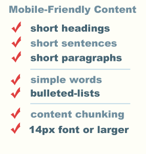
Try to keep your headings (headlines) short.

Also add sub headings and bulleted lists to help guide your readers. Mobile users want quick answers to their questions. They often scroll faster than desktop users, scanning content first.

Headings and sub-headings help break up content and improve readability. Visitors can quickly jump to sections they find interesting and not get lost.

Scannability

To design your content for scanning, aim for short sentences and paragraphs to help create white space.

White space is a must-have for mobile devices users.

Their eyes will naturally gravitate toward content with white space around it. Break up your content into short, bite-size pieces to make it easier to remember.

This is called content chunking.

You can also add brain-friendly information such as images, short videos and infographics to make scanning more enjoyable. Brain-friendly content helps the brain process what it sees and prevents it from getting overwhelmed by long walls of text.

Avoid “big words” when there are “simple word” alternatives to get your point across.

See more reader-friendly tips.

Mobile-Friendly Images

Graphics will make your mobile content more engaging, but only if they fit in the screen, are surrounded by white space and download fast. The bandwidth of mobile devices is much smaller than desktop computers so you want to create clear, crisp images with the smallest possible file size.

Flexible Page Elements

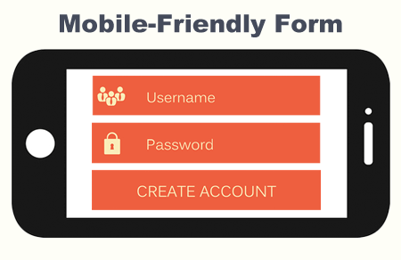
Check your web pages to be sure your images, tables, forms and videos actually fit in small screens. You may have some “inflexible” page elements in your “flexible” pages that you had no clue about.

mobile friendly form on a cellphone

  • Your login or contact form may look great on a laptop, while mobile visitors only see the “LEFT HALF” of it in their cell phone view.
  • Some or your pages could pass Google’s Mobile-Friendly Test while others fail.

Besides having flexibility, your graphics must also pass the legibility test. Unfortunately, many small business websites include fancy graphics that look fine on a large screen, but shrink down to illegible font sizes that the average mobile visitor can’t decipher. Your infographics may suffer the same mobile-readability issues, shrinking down to a fuzzy blur.

3) Create Mobile-Friendly Menus and Links

Take a look at your navigation menu. If your main menu is a huge panel of multi-tiered lists with 20 links or more, you should consider a different approach.

  • Don’t give your visitors too many choices all at once. It requires too much thinking.
  • Your navigation menu is not the place to link to every page in your site.
  • It’s best to limit your menu to eight items on the top level.
  • Also be sure to keep your main menu consistent throughout your site for all your visitors.

This is a user-friendly approach.

Finger-Friendly Design

finger friendly web designNow look at the size of the navigation buttons throughout your site. Clicking on links with a mouse is easy, but “TAPPING” with your fingers on a small screen requires more thought and effort.

  • One small button is hard to TAP.
  • Multiple small buttons squeezed close together could  trigger the wrong action.

You don’t want your mobile visitors to have to work hard to get around your site. It’s best to make your targets big and easy to spot.

A mobile-friendly website goes beyond an appealing site design.

It’s about quick page load times and organizing web content so mobile users don’t have to think too hard, work too hard or scroll too much. Your page elements must ALL fit in the small screen and be legible (without pinching and zooming). It also includes short words, simple sentences, short paragraphs and finger-friendly buttons. With a few simple tweaks, you can improve your website’s mobile-friendliness.

Image ALT Tags for SEO: What, Where, Why & How

We can probably agree that a web page without images is hard to read. Images not only help to improve user experience, they make tutorials easier to understand and products more enticing for customers. If you have a website, chances are that it includes a lot of images.

But do those images have ALT tags (a.k.a. attributes) for SEO?

I’ll explain the “What, Where, Why and How” when it comes to image ALT tags. The “What” and “Where” sections are a tiny bit technical, but will help you understand these seemingly unimportant attributes. Then the “Why” and “How” will convince you that an image and its “ALT” tag go hand-in-hand. If you add an image to a website, you should add an ALT tag too.

First, the word ALT tag is commonly used, though the correct terminology is alt text, alt attribute or alt description. I will use them all in this tutorial. You can decide which one is right for you. To understand them better, you have to understand a little bit of HTML. Let’s get started with “What” and “Where.”

(1) WHAT…

What is an image ALT tag?

Image ALT tags are short descriptions that can be assigned to images in a web page. They are used in HTML code to describe the appearance and function of an image.

How HTML helps you see Images in a Web Browser

HTML defines the structure and layout of a web page by using tags and attributes. Web designers use a lot of elements with tags and attributes to make up one page. (They can be seen in the source code of a page.) Curious? See HTML in the page source of a web page.

The HTML <img> element embeds an image into the document.

This markup tells a web browser how to display that image. Images are not actually inserted into an HTML page. The tag creates a holding space for the image. When a web page loads, it is the browser, at that moment, that gets the image from a web server and inserts it into the page.

The browser needs an image file with a name to find the image or you will see a broken link.

EXAMPLE: my-red-train.gif

red train image file name example

What is an Image File Name?

The image file name is the name you give an image on your computer before you upload it to your website. You should describe your image in 3-8 words, use hyphens in between and include relevant keywords for SEO.

Example: “my-red-train.gif” is better than “IMG6344376.gif”

<src>, <alt> and <title>attributes

HTML elements have attributes.  <img> attributes provide information about the image. This information is usually surrounded by quotes. It is the “value” of that attribute.

html image attributes: alt, title, src tags

<src> attribute

The <src> attribute tells the browser where an image is located. It is a required attribute for an image.

<ALT> and <title> attributes

The <ALT> and <title> attributes are not required. But not including the <ALT> tag  is an SEO mistake. You’ll see why in a moment.

(2) Where…

Where exactly is the ALT attribute located?

The <ALT> attribute is contained in the <img> element’s tag along with the <src> attribute. 

EXAMPLE: <img src=”my-red-train.gif” alt=“modern red train”>.

HTML img element with attributes

The <ALT> attribute has a value of “modern red train.” This information describes the train, but should also relate it to the web page. Image alt text, such as this, is source code information that most visitors will never see. I’ll explain more in a moment.

Common question: When I add an image ALT  tag to a web page, I cannot see the text when I scroll over the image.  I don’t understand this. Could you please help? 

Some people may be confused about the difference between alt text and the image title text attribute. They serve different purposes. We’ll compare them below.

(3) Why…

Why should I include ALT attributes (tags)?

 Image Alt attributes were first designed for users of screen readers. 

Image ALT descriptions can help visually impaired visitors understand images on a web page, even if they can’t see them. This “eye-opening” tutorial explains the usefulness of ALT text from the perspective of a web developer with vision impairment who uses a screen reader every day: Alt-texts: The Ultimate Guide. It’s worth reading!

Image ALT tags are also good for search engine optimization (SEO).

Image ALT tags help search engines associate images with a web page ‘s content so they can not only understand them, but also properly index them in their search results pages. Search engine crawlers may be able to pick out basic image colors and shapes, but not much more. When a search engine crawls your page, it won’t “see” your images the way you do.

If you’re uploading a balloon image, you will help Google, Bing and other search engines by explaining what kind of balloon you’re adding to your page. Also, what is its purpose? Do you sell balloons? Do you provide hot air balloon rides at your business? Are you using balloons as an example in your blog post about image ALT tags and SEO? Your ALT descriptions would be different based on how your image relates to your web page.

how search engine bots see images - hot air balloon and party balloon

Besides choosing a good image file name, adding ALT text to your images is one of the best things you can do for image optimization, which is a key component of  search engine optimization (SEO).

How can I see the image ALT tags on a web page?

In web browsers such as Firefox, the ALT text is displayed only when an image is broken or when all images have been disabled. You won’t see them unless you have broken image links, disabled images, a screen reader or if you’re a search engine bot.

  • If you see the image, you shouldn’t see the ALT description.
  • If you can’t see the image, you should be able to read the ALT description.

ALT tags versus Title tags

Google Chrome, Firefox and most other browsers do not display the ALT tag when hovering over an image. The title tag is opposite. It appears as a tooltip (in most browsers) when someone hovers over an image and won’t appear if the image doesn’t. Title tags are designed for people. They should should be short and relevant.

EXAMPLE: <img alt=“red train example for tutorial” title=“red train example” src=”https://www.crimsondesigns.com/red-train-example.gif”>

  1. src=“red-train-example.gif” is the image file (or source).
  2. alt=“red train example for HTML tutorial” is the image’s ALT text. 
  3. title=“red train example” is the image title.

(4) HOW…

How to Write Useful ALT attribute descriptions

When writing alt attribute descriptions,  you should describe an image in a way that is specific but also represents the topic of the page. ALT tags should not be full sentences or paragraphs and should not include special characters.  They should have a limit of about 125 characters. Consider 10 words or less. If you have a company logo, then ALT text should include your actual company name instead of  “company logo.” ALT tags are a great place to put one or two related keywords. Keyword stuffing, though, should be avoided. 

Keyword Stuffing Example:

<img src=”my-red-train.gif“ alt=”red train, train ride, train caboose, train cars and caboose”/>

How to Include ALT attributes in a Web Page

If you’re using WordPress or a similar platform, you should be able to add an image ALT and title description right after you upload an image. You can also click on an image in the body of a blog post to see a dialog box, where you can create and change the image’s alt text. You can also do this through the image edit screen in your Media Library. 

If you have a static website created by a web designer or web development company, ALT text has probably been added to all of your images. But you can double check with this helpful Image Alt Test. If you’ve designed your own website, now’s the time to check all your images for these important attributes.

Conclusion

Adding  ALT tags to images improves accessibility and user experience. It also provides greater relevance to search engines about your website content which will help drive traffic to your site.

3 Small Business Website Alerts: Don’t Get Blindsided

If you have a small business website, especially one that you haven’t paid much attention to lately, you’ll want to take a moment to read this blog post. Things are happening on the internet that will affect your website.   Read more…