You’ve spent many hours planning your website. It is chock-full of good keyword phrases, does a great job representing your business, and the pages download at lightning speed. You are also happy with the way it looks.
Now your visitors arrive. You figure that your extensive experience, exceptional service, and glowing testimonials will easily persuade them to choose your business over your competitors.
But your content-rich site may be missing one key ingredient: readability.
Is it actually enjoyable to read?
Consider, for example, your last visit to a movie theater. Did you put much thought into the chair you sat in or the temperature of the room?
More likely, you recall if you gave it a “thumbs up” or a “thumbs down.” You remember if the movie was a tearjerker or a comedy, but, not the cinema itself unless it was uncomfortable.
 If you had to squeeze into a small hard chair or shield your eyes from bright ceiling lights, it would surely ruin the movie. You’d want your money back. Your website visitors also have some basic expectations of your website. Consider not just what you have to say, but also how you say it to keep your audience comfortable and engaged.
Did you know that reading from a screen takes 25 percent longer than reading a printed page?
Your visitors may be in a bright office on a desktop computer or standing with a cell phone under a street light. They are dealing with their device and their environment at the same time. You must keep in mind how they are viewing your website, not just how it looks to you.
Why fuss about making a website reader-friendly?
Increased readability equals increased time on your website, decreased bounce rates and improved sales. Visitors who are delighted by their online experiences are more likely to become paying customers.
Keep in mind. Most people don’t read a website word for word; they scan headings first.
They often scan first, trying to decide if they want to read the content in greater detail. They will jump to something that interests them and skip irrelevant sections. They are likely in a hurry. If you can help them find what they’re looking for, you can help keep their attention longer.
The good news is that you can fine-tune your web pages. With some simple design techniques, you change a page from an unfriendly mass of overwhelming text to something more enjoyable.
1) First, Let’s Make our Content Easy to Scan.
Making our content easy to scan makes it easier to read.
Online readers like short sentences that don’t require much thinking. Make them short, succinct and to the point. You can also break up long pages into shorter easy-to-scan paragraphs. With these simple steps, you’ve already made the task of reading your web pages less of a chore.
2) Let’s utilize Headings and Subheadings.
Headings (headlines)
Your main heading is important. It helps your visitors know they are in the right place when they arrive at your page. If they came from a search engine, you want to reassure them immediately. Yes. They’re in the right place.
Make your headline an attention-grabber. Convince them to make the greater effort to read your paragraphs… or at least some of them. Your headline can help do that. Make it stand out visually. Also provide ample space beneath it.
Subheadings
Subheadings add structure to your content and give hierarchy to your page. They also summarize the paragraphs that follow. Use them to help visitors understand your page at a glance and choose which sections they want to read.
They should clearly stand out from your paragraphs, but be less visually dominant than your main heading. They are a level lower in the hierarchy than your headline (main heading) so should look less important. You can also use color to make subheadings stand out from the paragraphs below them.
3) Let’s be choosy about our font families and sizes.
A good, comfortable font size also helps make a page reader-friendly.
 Consider increasing font size for large screens and reducing it for small screens (such as cell phones).
- A good font size (not too big) promotes horizontal eye motion.
- A good font size (not too small) is readable.
Also, consider using a non-serif font for paragraphs such as Arial, Helvetica, Trebuchet, or Verdana. Fancy serif fonts are okay for headings, but for paragraphs, the little serifs in serif fonts easily blur together on a screen, making it more difficult to read the text.
4) Let’s use Left-Aligned Text for Paragraphs.
Most online text is aligned left, resulting in a ragged right edge. You can help your readers by providing a consistent left edge in your paragraphs. Left aligned paragraph text is much easier to read than centered text. Visitors can read each line by simply moving their eyes to the left edge. Their eyes don’t have to work as hard to find where the next line starts each time.
5) Let’s Fine-tune our Line Length and Width.
Line Length (the measure)
Reading a long line of type causes fatigue.
The reader must move his head at the end of a long line to search for the beginning of the next line. Long lines make it more difficult to correctly jump from one line to the next. Readers will often skim the left edge of a paragraph or accidentally read the same line twice.
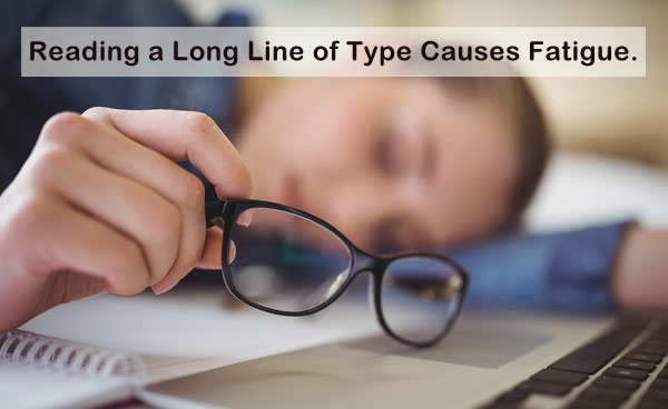
Short lines can also break the reader’s rhythm. The optimal line length (measure) on the Web is considered between 50-60 characters. A good measure improves the reading experience.
Line Height (spacing between lines)

Moviegoers feel crowded if the rows are tight. Readers struggle with tight lines.
Like the space between movie theater rows, line height is the space between individual lines of text. A line height that is too short is uncomfortable.
It will cause readers to squint and scan down the left edge of a page. They may also accidentally read the same line twice.
While there is no perfect line height, a good rule of thumb is to set it at approximately 150% of the font size. If your text is at 16 pixels, your line spacing should be around 24 pixels.
6) Add Some White Space for Extra Comfort.
White space also helps minimize the work your readers have to do. Start with good margins. Good margins improve white space. They help the reader focus inward on the main content of the page.
7) Use Images and Captions.

Popcorn makes a movie better. Popcorn images can help tell an online story.
Most people would agree that popcorn makes a movie better. Similarly, images make a website more enjoyable. Images help tell your story and keep your readers focused. They also increase your visitors’ average time on page.
You may have already scanned this page and jumped straight to the popcorn image, perhaps wondering about the connection between popcorn and website readability. It’s a bit of a stretch. I know.
Images like this one encourage people to stop and read the text that goes with them. Try adding a caption under an image to entice your reader to dig deeper. Image captions are read 50% more than the rest of the copy.
8) Use Ordered and Unordered Lists.
- Lists like this help break up big blocks of copy.
- They also look different from the rest of your text.
- The white space around them attracts the eye.
- They help show how different items relate to each other.
- Lists are very easy to scan.
- People like reading lists.
9) High Contrast minus the glow is Reader-Friendly.
The better the contrast between the background of a web page and the text, the better the readability. Poor contrast, on the other hand, will force your readers to squint.
Choose dark text on a light background for large blocks of text. When white text is placed on a dark background, computer monitors create an annoying “glow.” Consider your readers, not your preferences. If you do decide to use white text on a black background, decrease your font-weight.
10) Aim High with Mobile-Friendly Text.
Remember the cell phone users under the street light? How can we cater to them?
For optimum readability on mobile devices, let’s pay special attention to spatial hierarchy. Use short paragraphs. Mobile readers may get lost in long paragraphs. Use relevant images. Studies show that mobile users look at images more than they look at text. Relevant images help tell your story.
The fonts that you choose will also make a difference in mobile devices. Be sure to use sans-serif fonts in your paragraphs.

The small screens also make it difficult to read lines of text that are set close together. Don’t squeeze them together. Consider increasing line-height to 1.75 and decreasing the measure to roughly 35-50 characters.
Be sure to utilize a responsive design to help your mobile readers.
A responsive website responds to the viewport of the device, improving readability. With responsive design, CSS media queries can be used to change the visual styles of a web page based on a visitor’s screen size. This means that you can use one set of typographic styles for larger screens and another set for smaller screens. So you can keep everyone in your audience happy.
You may not be able to woo your website visitors with popcorn, 3-D glasses or surround sound, but you can pamper them with white space, images and headings. Make them comfortable. Help them find what they are looking for so they can be on their way. They may not notice your reader-friendly efforts. That’s actually a good thing.
Return to Top