Curious if your website is user-friendly? It may not be easy to tell at-a-glance. A user-friendly website has these 8 characteristics.
- It loads fast.
- A user-friendly website is not only visually pleasing, it is accessible and useful.
- It is easy to navigate, easy to comprehend and easy to read.
- Users can find what they’re looking for and get there fast.
- It has a consistent look-and-feel.
- It makes the user’s journey effortless.
- A user-friendly website is also inclusive. It considers the experiences of the blind, disabled and elderly.
- It is also mobile-friendly.
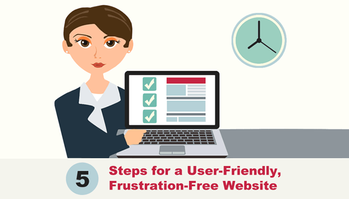
Here are 5 Steps you can take to make your website a user-friendly, frustration-free experience.
Step 1) Smooth Landing
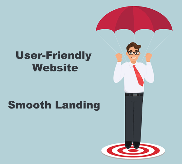
To provide a smooth landing for your visitors, you must take a look at page speed.
Nobody likes a slow website. It can annoy, or worse, drive visitors away. Before you can engage prospects and generate leads, you must first welcome visitors with fast-loading web pages (preferably within 4 seconds). Check your page loading time at Pingdom or Google PageSpeed Insights. Keep in mind, though, that not all pages are alike. You can have a lightning-fast home page and a photo gallery that loads at a snail’s pace.
Familiarity – There are well-known web design conventions used these days that visitors appreciate. Use these conventions and you’ll make them feel at ease as they walk in the door. You don’t want visitors to get flustered by an odd layout. If they do, they’ll move on.
What do website visitors expect to see?
- They expect to see a “clickable” logo in the top left corner of your pages. It should provide a way back to your home page.
- They’re relying on your icons (such as the shopping cart icon) to make sense without any explanation.
- They’ll look for that shopping cart icon in a web page’s top right corner and want to see some sort of validation if they remove an item from their cart.
- They will expect to see a search box in the upper-right corner of the screen also.
Step 2) Orientation
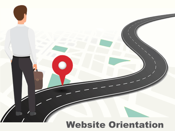
Visitors want to know right away (1) what your site is all about and (2) what it has to offer. Your home page must help them answer these questions.
What if a visitor doesn’t land on your home page?
First-time visitors may not land on your “home page” first. If not, they’ll look to the header and main navigation bar to get oriented. No matter where they enter your site, leave out the guesswork. Help them get oriented so they can figure out which way to go next. Then make it as easy to navigate as possible.
Step 3) Obstacle-Free Exploration

A user-friendly website uses links throughout its pages (not just in a navigation bar) to help visitors explore with ease. If they have to dig through multiple pages to register for a class or make a purchase, they’ll get annoyed. If navigation is not intuitive, they will be less likely to return. Help them get anywhere they need to within one or two clicks.
7 ways to improve navigation:
- Keep your navigation bar simple. Limit their choices.
- Also keep sub navigation menus to a minimum when possible.
- Remove broken links on your site. Visitor who encounter 404 pages may bounce back to Google.
- Use meaningful text on your content links, instead of “click here.”
- Make sure your page content links look “clickable.” They should be underlined, shown in a different color or displayed as buttons.
- Provide a way for users to explore your site without a mouse. (Some customers can’t use one.) These users navigate via a keyboard with their tab and arrow keys and “click” links with the enter key. Also make it easy for mobile users to get around… without a mouse.
- Include an HTML sitemap on your website. Users who visit this web page see a list of all your web pages (with clickable links). If your navigation menu is complex, an HTML sitemap might help users get to the right place.
To help your visitors explore your site, you must also “format content” so they can scan through page sections quickly.
Let them scan.
Make your content easy to scan with the use of headings, sub-headings, paragraphs, bulleted lists and white space. Also provide good contrast between the background and text. The contrast needs to be great enough so that readers do not strain their eyes.
Include relevant images (with ALT text). Images included in a web page should be relevant to the page topic. They must also be easily understood by those who can’t see them, such as screen reader users. Providing ALT text is a user-friendly, SEO friendly measure. Also be careful with animated images. Some visitors may find fast-moving or flashing images problematic.
Provide user feedback.
To help people interact with your site, purchase products and fill out forms with ease, you must provide feedback.
User feedback makes people happy because it helps guide them through steps in a task, gives them a signal that they’ve succeeded or failed, tells them if errors have occurred and indicates what to do next. By simply seeing the number of items in a shopping cart, a user understands how many they have successfully added. When a user attempts to submit a form with an empty required field, an error message and highlighted field border will help get them back on track. User feedback will reduce the number of website obstacles that your users may encounter and help them reach their goals.
Step 4) Seamless Shopping Experience
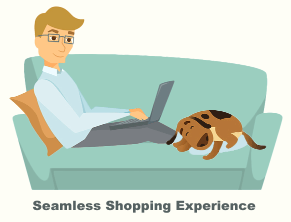
When it comes to a great online experience, shoppers primarily expect three things: speed, ease-of-use and consistency. They should be able to purchase something with minimal effort and be barely aware of the site itself.
Your products should take center stage.
6 ways to improve product pages:
- For user-friendly product pages, first pay attention to page loading times. Nobody likes a slow product page.
- Ensure that these pages don’t look overcrowded. Add whitespace around each image.
- Include thumbnails and product image ALT text.
- Keep your product pages consistent from page to page.
- Include user-friendly tools such as a search box, digital bread crumbs and filters. They will save your customers a lot of time. Digital breadcrumbs show the path that users have followed to reach their current point. Product filters (such as color and size) help users find the type of items they are looking for faster.
- Keep the checkout process as simple as possible. Combine or eliminate unnecessary screens or steps. Be sure to include user feedback along the way.
Step 5) Frustration-Free Forms
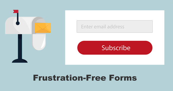
Nobody likes forms. They often require a lot of typing, accuracy checking and error-fixing. Since they’re usually not a fun task, it’s essential to make filling them out as simple and user-friendly as possible.
7 ways to improve your forms:
- Make your forms sticky. When users submit a form and are told to go back and correct something, be sure your form retains the information they already entered. This makes it a sticky form.
- Present form fields in a logical, sequential way.
- Don’t ask for more information than you actually need.
- Don’t make form fields “required” that aren’t crucial.
- Make the submit button easy to click, especially for mobile, elderly and disabled users.
- Label all form field inputs to help non-visual customers understand your form.
- Display user errors with clear instructions. Make it simple to find fields that need to be re-entered.
Summary
A website’s first impression is important. But if you want visitors to engage with it, you have to do more. Provide a smooth landing. Help visitors get oriented. Remove any obstacles. Provide user feedback. Be inclusive. Strive to make your website enjoyable and frustration-free. It’ll be more than impressive. It will be user-friendly.
Return to Top