It’s hard to run a business and stay on top of everything. But you know deep down that your website has been gathering a little dust. It’s sitting there somewhere on the internet at a host whose name you can’t remember off the top of your head.
But every once in a while, someone reminds you that you don’t look anything like your website photo these days. So how do you know if it’s really worth the time and effort to update it… or can you just wait one more year?
This Business Owner Checklist will help you decide if it’s time for a website redesign.
It includes 8 Simple Ways to tell if your website is old. All you need is about 10 minutes to complete it. Simply grab a cup of coffee and a notepad, and of course, you will have to visit your website on a computer. You will be adding a check mark to your notepad for every item that your website fails to meet.
Ready? Let’s begin.
(1) Page Titles
Let’s go to your website right now. Bring it up in a web browser, such as Google Chrome or Internet Explorer, and look up at the very top of the screen. You will be able to see the Page Title of your home page. See it? Good. Try to remember it for a moment.
 Now click on a link in your website and go to another page. Do the Page Titles look the same?
If the page titles are the same for every page or your website or are not very descriptive of your web pages, please add a check mark to your “Time for a Website Redesign” Checklist. You have your first important reason to hire a web designer.
(2) Your Copyright Date
Now go to the bottom of one of your web pages and look at the copyright date. Is the year listed there up-to-date? If not, please add another check mark to your list. Having an old copyright date is an indication to visitors that your website has old content. Your visitors want to know that your website has trustworthy and up-to-date information. An outdated copyright date is the first thing that will cause your visitors to lose their trust in you.
(3) Page Speed
When you loaded your website in a browser, how long did it take to see the whole page? Was there a noticeable waiting period? If so, search engines, such as Google, and your visitors will not be impressed. The days of slow-loading and cumbersome websites are gone. Your visitors want to be able to navigate around your website quickly and easily.
If your website is slow to load, add another check mark to your checklist.
(4) Mobile Devices
Next let’s discuss mobile devices. Is your website easy to read on a mobile device such as an iPad or an iPhone?
Browsing the internet is no longer an activity confined to desktop computers. Mobile browsing is increasing every day. Your website needs to be ready to receive mobile traffic.
It can be really annoying for website visitors to pinch and zoom into the copy of your website, scroll back and forth, and try to hit tiny buttons to get to a specific page. You don’t want to create a bad mobile experience for these customers because they are a growing population. You just can’t ignore them anymore.
Does your website look good in the smartphone or are you squinting very hard to try to read the text? If you can’t read the content without zooming in, you will have to add another check mark to your list.
How many checks have you added so far? Are they adding up?
Let’s look at a few more before you make that overdue phone call to a web designer.
(5) Website Navigation Buttons
What do you think is the latest trend when it comes to website navigation buttons? The trend is towards bigger and sometimes even round navigation buttons. This is also due to the increasing popularity of mobile web browsing. Mobile web browsers “touch” and “tap” screens instead of using a computer mouse to click on links. So web designers are moving towards bigger buttons to make “touching” and “tapping” easier.
Do you have any website button links on your website? Can you imagine tapping them with your finger to get to another page or are they too small? Bigger is better these days.
(6) Cascading Style Sheets
Does your website use separate Cascading Style Sheets (CSS)? It’s okay if you don’t understand this one. Let me explain. In the earlier days of the internet, the content and design of a web page were all in one file. Today, content goes in one file and most of the design goes into a style sheet. This makes editing a lot faster, easier, and more flexible.
How can you tell if you’re website is already using CSS?
A quick test to see if your site is using CSS is to load a web page in your browser. Then right click anywhere in the browser window with your computer mouse. A menu box will appear.
Click “View Page Source.”
The page that pops up will be full of text that is hard to read. If so, you are in the right place.
Look closely for text like this: <link href=”css/style-index.css” rel=”stylesheet” type=”text/css” media=”all”> near the top of the page.
See the word “stylesheet” in there. It shows that there is a link to a cascading stylesheet. If you find one, you can breathe a sigh of relief. No check mark is necessary here.
(7) Contact Forms
![]()
We have two topics left. The first one is all about Contact Forms. Nowadays, contact forms are found in most websites. If your website is current, your web designer probably used HTML5 to code your contact form page and CSS3 to code the cascading style sheet. If you’ve never heard of HTML5 or CSS3, it’s okay. But your web designer should be familiar with both.
With the help of HTML5 and CSS3, stylish contact forms can be designed. But more importantly, HTML5 contact forms are fun to fill in and submit. Again it’s all about great user experience. One of the best features of HTML5 forms is that they can be validated using a modern web browser’s built-in form validation.
What is form validation? You ask. Form validation helps guide visitors, alerting them to what information they need to include in the form fields so they don’t fill in a bunch of useless information or leave an important field blank.
In the example below, see how a web browser (Firefox) displays a “hint” to the visitor who has left a field empty in the contact form. Web browsers mark the required but empty form field with a “cartoon bubble” warning. Thanks to HTML5, online forms are getting a whole lot better.
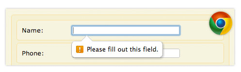
Does the Contact Form on your website provide helpful hints to your visitors as they go along? If not, please add another check mark. Should we call it the “I desperately need a website redesign” checklist now?
(8) Google and Other Search Engines
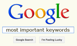
#8 is probably the most important topic in this list. Think for a moment. What words or phrases (2 to 3 words) come to mind when you think of your business? Are these words or phrases you would expect visitors to put into a search engine’s search box when they try to find a site like yours? Great. Take a few of those keywords and keyword phrases and go to Google. If you put them in the search box, what results do you get? Can you find your website in the list of results?
Is your business nowhere to be found or worse yet, you find all your competitors in the list instead? That’s really bad news. If visitors can’t find your website in a search engine, then your website either needs a major makeover or is not really worth having at all.
Please add 3 checks to your checklist if you fail to show up in the search engines.
Now add up your check marks. What is your total?
0 = your website is in great shape.
1 to 3 = your website is in good shape.
4 to 6 = your website needs a redesign.
7 to 9 = your website redesign is a priority.
10 = get on the phone today and call a web designer.
Hope you had fun with this tutorial and learned something new about your website. If you decide to meet with a web designer and they mention mobile devices or HTML5 or CSS3, you will know you are talking to someone who is keeping up-to-date with the latest trends in web design. You are on your way to a better website.
Return to Top
One comment
Love the idea of a checklist to determine the need for a website redesign!
Chris