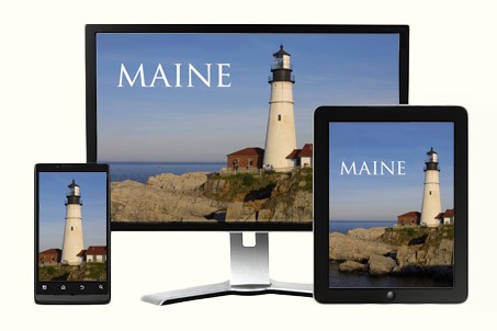
In 2013 people are starting to talk about mobile friendly web design. Business owners are wondering if their websites are mobile friendly. They want their visitors to have a great experience on their website regardless of whether they are using a cell phone, an iPad or a computer.
“Is my website mobile friendly?” “Can you make my website a mobile one?” They ask.
Unfortunately, in 2013, most business websites have been designed with only a desktop or laptop computer in mind. When you view a typical business website in the browser of a mobile device, it usually requires pinching, zooming and scrolling with your fingertips to see what’s on the page. And interacting with the website is often awkward and clumsy.
What most business owners are really looking for is not a mobile design.
What is a mobile design?
A mobile design is a web design that creates a mobile website usually in addition to the desktop version. It is designed specifically for mobile devices. A business owner with a mobile design often has two websites to maintain.
Most business owners are really looking for a mobile friendly responsive web design.
What is a responsive design?
A responsive design approach utilizes one website across multiple devices instead of creating a separate mobile site. The website automatically orientates itself based on the screen size of the device it is being viewed on. For instance, a three-column website layout on an iPad might become a two-column layout when the iPad is rotated, and a one-column width when viewed on a smartphone screen. Images scale and columns disappear.
A responsive web design utilizes CSS3 Media Queries, Fluid Images, Elastic Videos, Flexible Layouts and Responsive Navigation Features that can be easily manipulated on a touch screen.
You can often spot a Responsive Website by examining its Navigation Menu.
Navigation menus in responsive websites are designed to be user friendly. They must work for those who click or tap on their screens. Larger navigation elements with big bold buttons are becoming more popular, while multi-level dropdown hover menus are losing their popularity. Touch devices are driving this trend because big bold buttons are most comfortable for users tapping on their mobile devices. If you see BIG ROUND BUTTONS, like in the example below, you are probably visiting a responsive website.

Let’s explore some great responsive Maine websites.
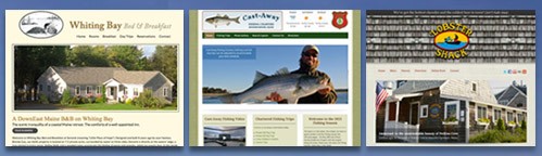
Lobster Shack in Perkins Cove in Ogunquit Maine
Cast-Away Fishing Charters in Kennebunkport, Maine
Traveling along the Maine Seacoast with a Smartphone
First Stop: Lunch
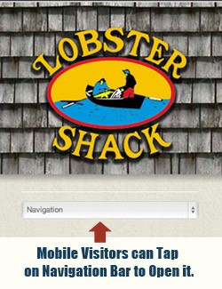 Let’s say that you’re driving along the coast of Ogunquit, Maine, smelling the salty air, and feeling some hunger pangs. You decide right then and there that you want a MAINE LOBSTER ROLL on a toasted bun with mayo. Luckily, you have your cell phone handy so you use it to access a search engine on the internet. You click on a link, finding your way to the Lobster Shack in Perkins Cove.
The very first thing you’ll notice is how easy it is to navigate through the website. The phone number is displayed in big numbers at the top of the screen, the Navigation Menu can be tapped open or closed, the LOBSTER ROLL is easy to locate and the directions to the restaurant are right there too. You’ve just spent 5 minutes enjoying a great experience on a Maine website with a responsive design. And a half hour later, you’ve just finished your lunch.
You continue to travel north, taking in all the wonderful scenery that Maine has to offer.
Next Stop: Fishing
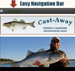 Spur of the moment, you decide to go on a half-day chartered fishing trip. You grab your smartphone again. You’re in luck! Right up the road, you’ll find Cast-Away Fishing Charters in Kennebunkport, Maine. They offer a 4-hour charter from noon to 4pm. You can fish the coastal Maine waters for Striped Bass, Bluefish and Mackerel. You also learn through the website that Cast-Away Fishing Charters practices catch-and release fishing and encourages anglers to maintain a sustainable approach to sport fishing.
But did you also notice that the website has one of those Responsive Navigation Bars that you can tap open or closed? Did you notice how easy it was to explore the website and go from page to page? You’ve just experienced another great Maine responsive web design.
Last Stop: Place to Sleep
After spending hours on the ocean, you hop back into your car. You then make an impulsive decision to stay overnight at a Bed and Breakfast. You now realize that a Responsive Website is what you hope to find again.
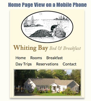
This time you reach Whiting Bay Bed and Breakfast way up north in Whiting, Maine.
Looking at the website, you can see how quaint and affordable the guest rooms are. You learn that you will be able to eat breakfast outside on the deck, where you may hear the call of a LOON from the bay. And free Wi-Fi is available.
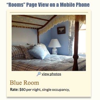
The Bed and Breakfast website’s navigation is a little different from the other 2 websites you visited on your trip. There is no “open” and “close” navigation button that you tap on. Instead, the 6 links on the navigation bar are flexible. On smaller screens, the 6 links can be seen in two or three rows, instead of stretching out to one long row, like they do on a big screen. They work beautifully for this website. Using your smartphone, you make your way quickly to the “Rooms” page where you decide on the “BLUE” room after seeing the price and photo.
The next morning, you wake to the sound of LOONS on the bay and enjoy a wonderful breakfast. You feel refreshed and ready to get back to work. You decide to check your own business website with your smartphone. And that’s when you realize that your website is not so mobile friendly. You’re frustrated because you have to pinch, zoom and scroll with your fingertips to see what’s on the page. And you are finding the experience awkward and clumsy.
But now you know that you can’t blame your smartphone. You need to redesign your website.
More Responsive Websites Spotted in Maine
I Love Bar Harbor in Bar Harbor, Maine
Penobscot Marine Museum in Searsport, Maine
Animal Refuge League of Greater Portland in Portland, Maine
The Art of Michael Ranucci

You may also be interested in: Responsive Web Design Trickles into New Hampshire.
Return to Top